Posts

Portfolio

Image
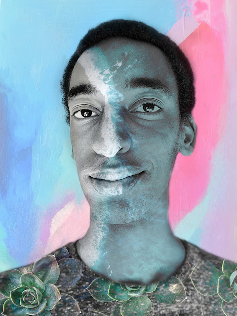
Artist Statement: My portfolio took the longest out of all my projects to due. Insert photoshop and illustrator files into indesign made the film rather large, and formatting the template (which was originally a magazine template) to work as a portfolio was a time-consuming task. Overall, I like how it turned out. I chose to put my Autoscopy photo as the cover of the portfolio because not only is it a picture of me, the artist, it also accurately reflects the personal style of art of many of the works I included in my portfolio. I am proud of my portfolio and how it turned out. 

Business Cards

Image
This project actually took me about 4 hours. It was hard to find a background design that matched my logos, but I think in the end the project turned out well. For my first card, I went with a circular design with my logo in the middle and my name lining the outside of the circle. For my next card, I wanted to make a sleek steel background using a gray gradient. For my last card, I kept a colorful design to match the logo.

"Somewhere" Project

Image
 For my project, I decided to place myself in the promotional poster for the film Parasite. This is one of my favorite movies because it has multiple layers and meanings, and it was my first choice for this project. I chose this poster specifically because it gives a brief teaser of the movie without spoiling the whole film. For this project, I took a picture of myself in front of a solid color wall, and used both the magic wand and the selection tool in Photoshop to create the illusion that I was actually in the poster. This project took me about 3 hours total and I am very proud of the result. 

Autoscopy

Image
For my autoscopy project, I decided to use overlay scenes of paint, the ocean, and plants on my face.. Playing and experimenting with the numerous effects in Photoshop was very fun and I used layers to create the desired effect. I think that the various colors on top of a black and white image effect gives my photo a professional feel, and the different images of nature give it a calming feel. I look forward to experimenting with Photoshop more in the future. Autoscopy Original

Photoshop Blog Posts

Image
This would be extremely hard to photoshop yourself into due to the specific lighting and shadows in the shot. For example, Kirby had to photograph himself sitting down wearing an outfit complementing Kendall's, and then later place himself on the bed with her. Overall, the photo is so well done it does not even look photoshopped. This is good inspiration for the project because I would want to photoshop myself running in city streets being chased by a cat. This is very creative and probably took a very long time to do This was a funny post. I like how the account made light of people asking for photoshop requests. I would want to recreate this image. I like the multiple colored shadows and I think the effect turned out really well.

Self-portrait poster

Image
This project took me about 5 hours to do. The majority of the time was spent tracing the original imagine and getting the curves and outline precise. Afterwards, I used the gradient mesh tool to color most of the shapes. I tried to use a lot of gradient colors to create a slightly 3d feel.  The text behind me is a quote from Doctor Seuss: "Be who you are and say what you feel because in the end those who matter don't mind and those who mind don't matter." This is an inspirational quote for me because it inspires me to share my opinions regardless of what others think. I enjoy using text as art and had a lot of fun with this project.

B&W to Color

Image
For this project, I decided to do a subtle color shift on the patterns on my shirt and my beads. I thought it would be visually interesting to have a mostly black-and-white photo with a pop of color. The most interesting part of this project was learning the relationships that colors have with each other through the adobe color wheel. I was always aware of primary and complimentary colors, but I never heard of "triad" or "analogous" colors until now. Using photoshop was a new experience to me, but it seemed somewhat familiar because the interface is similar to Adobe Illustrator. Using the selection tool was simple and it seemed to do a good job detecting the different shapes in my shirt.